


- Investments
- Sports
- Stories
How to Edit Photos Like a Pro: Color Harmony
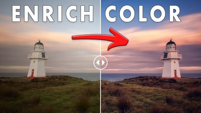
Master the Basics of Color Theory
Understanding tones and relationships in editing GIMP
To edit photos like a pro, learning the basics of color theory is a necessary step. Colors are more than visual elements—they evoke emotion, highlight subjects, and bring a scene to life. In editing, understanding the relationships between complementary, analogous, and triadic colors allows you to enhance your images with intention. Warm and cool tones create contrast and mood, while neutral tones provide balance. By applying these principles, editors create photos that not only look appealing but also feel cohesive and professional. Even with simple tools like GIMP , grasping these color connections helps you build consistency and style.
White Balance Correction Made Simple
Maintaining natural tones with every adjustment
Correcting white balance ensures your image reflects colors as they appear in real life. When a photo is too cool (blue-tinted) or too warm (orange-tinted), it loses authenticity. Adjusting the white balance sets a neutral point from which all other tones fall into place. Start by identifying a neutral gray area within the image, then adjust warmth or coolness to make whites truly white. This subtle shift restores the image's realism. Tools like GIMP offer color temperature controls that help you do this without relying on presets. It’s one of the simplest yet most impactful ways to elevate a photo’s look.
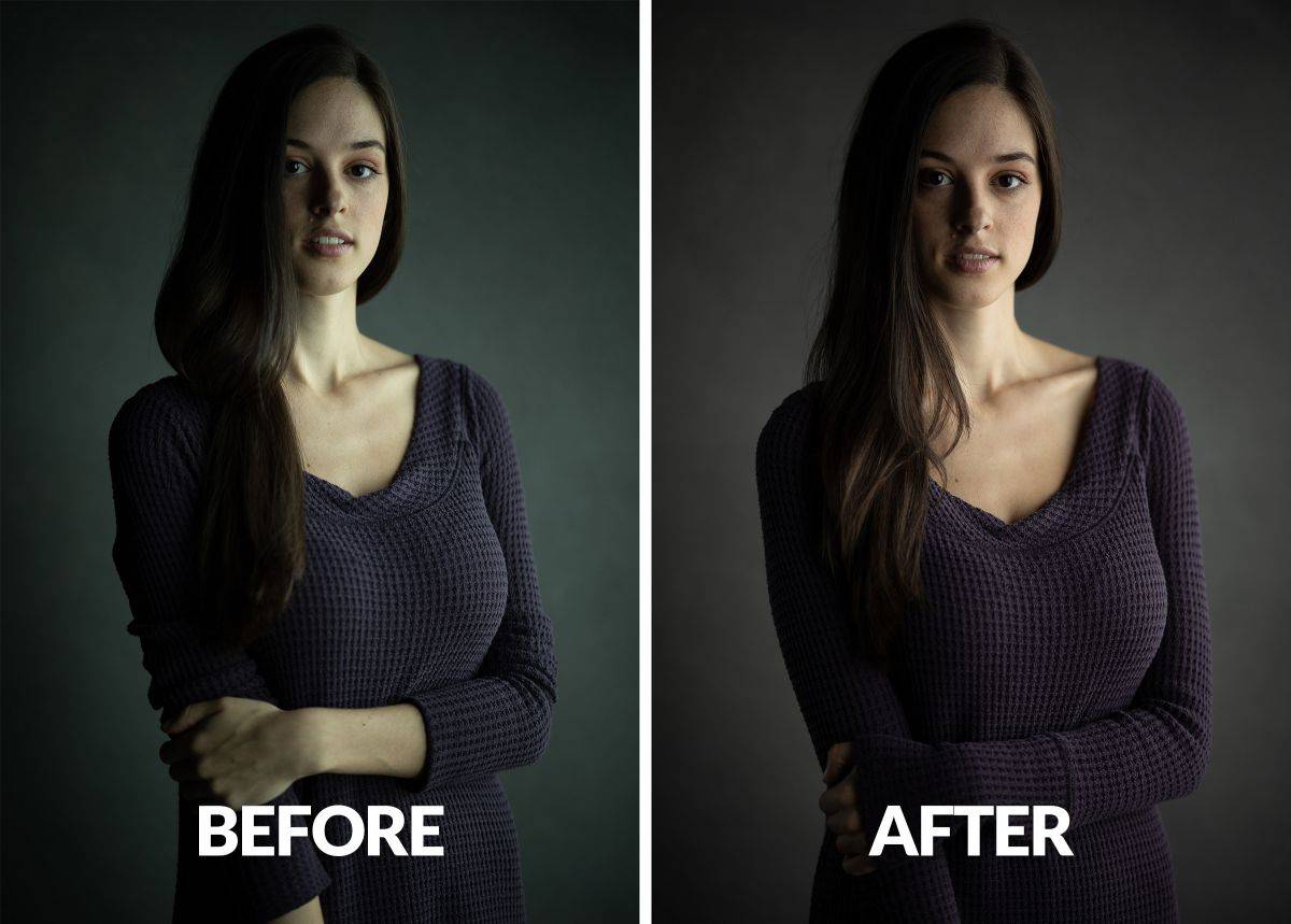
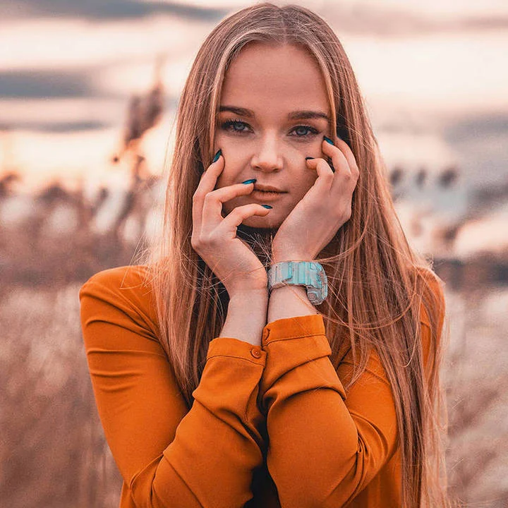
Brightness Without Overexposing Skin
Retaining tone depth in portraits and lifestyle shots
Boosting brightness can improve the overall clarity of a photo, but doing so carelessly may bleach out important features—especially skin tones. Skin should retain depth, warmth, and natural shadow. To increase brightness while keeping faces and hands true-to-life, avoid pushing exposure too far. Instead, use local adjustments to brighten specific areas, and adjust highlights and shadows separately. Editing programs like GIMP give you tools to create custom masks, so you can control light precisely. The goal is to uplift the image’s energy without sacrificing the natural character of your subject.
Color Palette and Emotional Balance
Aligning tones with mood and composition
Every image tells a story, and its color palette plays a key role in that narrative. Calm scenes may benefit from cool, desaturated hues, while vibrant settings thrive on bold, energetic tones. Matching your photo’s palette to the emotions you want to convey adds harmony and depth. For instance, editing a romantic portrait with soft pinks and warm browns can enhance tenderness. Meanwhile, action shots may call for stronger contrasts and saturated primaries. With GIMP , you can create your own color grading layers that shift hues slightly, enhancing mood without overpowering the original scene.
Subtle Shifts Create Greater Impact
Tweaking hues without overwhelming the image
Overediting can strip a photo of its realism. Instead of drastic changes, professional editors rely on subtle enhancements. Slightly adjusting the saturation or vibrance can make colors pop without appearing artificial. A trick to remember is to step back frequently during editing—look at your work from a distance to judge if tones remain believable. Soft corrections ensure harmony across the frame. You can also use selective editing tools in GIMP to target specific color zones, like adjusting only the blues in a sky or the greens in foliage, preserving the integrity of the photo’s natural look.
Tone Curves for Color Refinement
Bringing balance through precise editing tools
Tone curves aren’t just for light—they also affect color balance. By manipulating individual red, green, and blue curves, editors can shift the overall color mood of a photo. For instance, raising the red midtones adds warmth, while reducing blue shadows cools an image. These subtle refinements require patience but deliver precise results. Even in GIMP , the curve editor allows pinpoint control over specific tonal ranges. Learning to use tone curves not only helps correct color imbalances but also allows you to infuse personality into your images without compromising realism.
Avoid Harsh Color Editing Mistakes
Keeping balance while enhancing the frame’s feel
Color editing is as much about restraint as it is about enhancement. One of the most common mistakes is oversaturation—where colors appear unnaturally bright and distract from the subject. To avoid this, keep an eye on skin tones and natural elements. Greens, blues, and reds are especially prone to becoming overpowering when increased too much. Use the hue/saturation sliders in moderation, and always compare before-and-after views to check your progress. Editing like a pro means making the image better—not louder.
Creative Color Grading Without Overkill
Using personal style without losing authenticity
Color grading is where editing meets artistry. This process lets you apply a stylistic color signature across your work. Whether it’s warm vintage, cinematic teal-orange, or faded film looks, the secret lies in balance. Use layers to separate effects and always test your edits on multiple images to ensure consistency. Editing platforms such as GIMP allow you to reuse layer settings, enabling a reliable and repeatable approach to color grading. With enough practice, you'll be able to develop your own recognizable style that complements, rather than overwhelms, the photo's story.
Final Thoughts on Color Harmony
Editing photos with tone, taste, and precision
Achieving professional photo edits doesn’t require complex tools or shortcuts. It takes knowledge, subtlety, and a trained eye for balance. By mastering white balance, embracing tone curves, preserving skin tones, and matching colors to emotion, any image can be transformed. Tools like GIMP offer everything needed to perform these edits with precision. Ultimately, color harmony is less about saturation and more about storytelling. With patience and purpose, every edit can bring your photos closer to that refined, professional finish.
Top Comments
-
Ellise White
This blog is a place where everyone can find something important and valuable for themselves. Thanks for sharing! -

Kadeem Rosales
You have a great sense of humor, each of your posts is a small dose of positivity and smiles. Awesome! -

Ellesha Holcomb
I should have read this sooner!